This photo is of the legs on an antique table I have in my house. The curves and shapes of the objects is what I think makes this photo interesting. Also with the combination of blurry and sharp images. I tried to compose the subject so that the shadows and glares work together and the shapes were emphasized.

Really I think that this photo is quite cliche. I've seen it done before and I'm sure that you have too. Honestly, when I first took this photo I didn't think that I would use it as a final print. But in lieu of more recent circumstances, I had to use it. I was the only piece of film that would develop well enough.

I say a photo a long time ago that used a fence post to block out the sun. This is my remake. It may be too barren, or plain, but if you give it a chance I think that you'll realize that it's not so bad. But I do like the simple line in the photo, It grows on me everyday.

Isn't he adorable. It's Paul, dropping snow in front of his face with a unique, Paullike, smile. I couldn't think of a better way to portray Paul's day to day attitude.

Matt likes cookie dough. I think I'm going to name this one that. It's fitting. Guess what he's eating...yep that's right cookie dough. Nice job.

I like this one. It fits my style, or at least the style that I was going for the day I was taking this picture. The actual subject is a lamp shade that looks fairly antique-ish. It's hard and metal and as you can see it casts quite a good glare making for some interesting contrast.

I really like this photo. (Isn't it unnecessary how I switch from calling them pictures and photos?... annoying huh) I will tell you why I like it. The composition and composure is nice I think, it fits the frame I guess you could say, but most of all I like the texture. I can honestly feel the thick grain of the wood when I look at it. Fantastic!

I like the motion in this photo. It's neat I guess but I really like the composition of his body in the frame. It almost looks deformed; it's not normal. I like that about it. It's unique. I could of made a cliche print of a dog running, legs stretched out, eyes wide open, but instead I made him look like this. He looks more like a dog, not the stereotypical look for a dog.

This photo, like many of mine, has some sweet contrast. I decided that contrast is absolutely crucial because the picture is black and white. There is no color. Nothing to make it pop, unless I have some contrast. A vibrant red in one of my pictures just turns out to be and thick grey and doesn't have the same affect.

This photo is my favorite. My hope is that it feels erie. Makes you feel unsettled and uneasy. I hoped I could stir your inner emotions in a subtle way that you wouldn't at first notice. Did it work?


 I don't know his name. I'm not going to do any research on him. I don't know what he's carrying. If he were to say something to me, I wouldn't understand a word. But I love his walk; it's almost a strut. Hand high, slight smile, intently focused on the ground in front of him. When I look at him, I just think of innocence. To use some photo vocab, I like the the use of still motion, the shadow on of the face and the simplicity of the the pose; there isn't any modifications to the photo, it's just this kid.
 This one's different. I know who he is. His name is Jacques. He lives in Montana with my brother. This picture was taken by my brother in New Zealand. I just really like his smile. His near classic look; stunningly red hat, unshameful scruff on the face, and a fish in hand. I love how the colors of the trees and grass and river and coat all mess, then your eyes are forced to stare right into the the smile on his face.

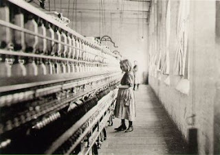
 Okay, so this picture was on my blog before too. I'm not worried about it. I really like looking at the pattern of the contraption on the left. The girl standing alone. hell, is that cliche? I think so. Not going to lie, I'm really tired right now and it's hard to focus. But that's the beauty of a blog, you don't need to be perfect, 'cause it's a blog. Anywho, this photo was taken by Hines, who tried to bring attention of the issue f child labor through photos. A noble act I thought, and that's the real reason why I decided to post this picture.
